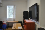
Creating the space for the exhibition was no easy task, since no space had been chosen out right we were tasked with coming up with the initial concept. We decided to make use of relatively cheap materials.The first task of the construction team was to create accurate blue prints of the rooms we needed to have exact measurements in order to plan the space out. While this was going one we had to gather funds for our spaces. So we held a fund raiser where we served cupcakes and cocktails I helped out behind the bar by taking care of the cash. The construction team then gathered an accurate list of the projects that each student would be displaying. This was important and vital to have a clear idea of what sort of structures would be needed. We decided to split up the two rooms by the projects printed projects where left in studio 4 and the digital projects where placed in Degree 3D. We also made use of the hall for displaying a few projects.
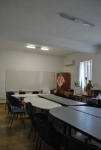
After we had settled on the location for class projects we began to design the overall layout of the rooms. We wanted to create a clean and functional space that would not distract the audience from the projects. We came up with a few concepts and through the guidance of out lecturers we opted for the most functional concept.
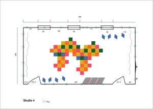
We composed a list of materials that we would need in the construction of our space.We began to move all the existing furniture out of our allocated spaces and into the printing suite near the Greek theatre. After we moved all the equipment and furniture out of the spaces we began to mark out the location of all the students and where their projects would be placed.
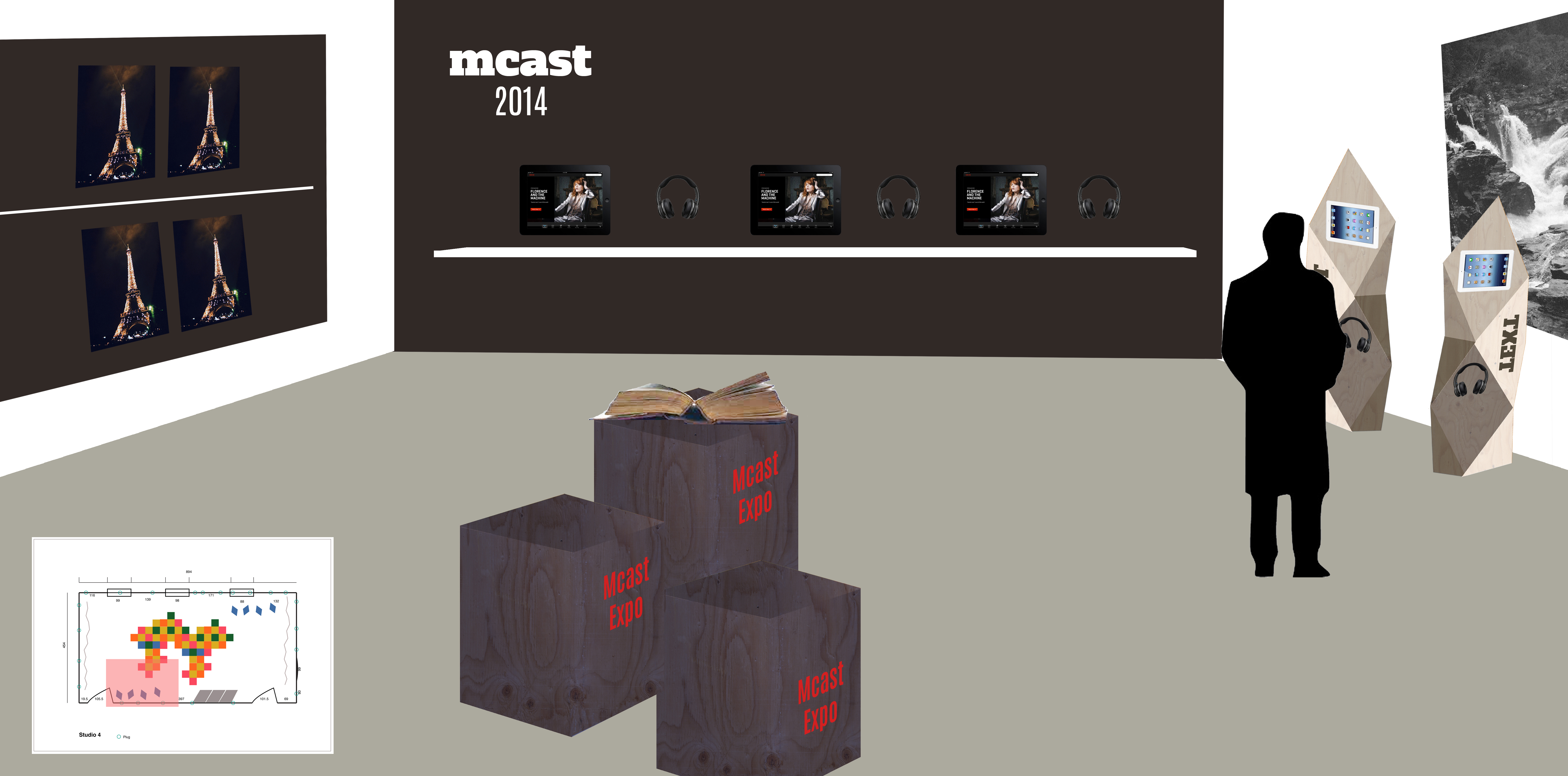
Until the materials arrived we worked on cleaning up our space and making it as clean and organised as possible. We painted the rooms since they had not been painted in a while and where dirty. We also came up with a design for the degree 3D wall where we used the colours in our brand guide lines to create a design on the wall to create a theme in the studio. We created a striped wall pattern. We continued the used of colour by painting one of the main walls in the opposite room orange. This helped to create a warm and welcoming environment for the guests.
The materials arrived and we began to construct the stands that we would make use of for the exhibition. The bulk of the wood was transported to Francesco Darmanin’s house where it was cut and sent back to school to be assembled. While the stands where being constructed we worked on the wool lanterns that would be used to help create an atmosphere in the room we made the lanterns out of wool with the use of a latex balloon to create the mold. This took a lot of work since they are relatively delicate and the process of creating them is messy. We created over 20 small ones and 4 larger ones
when the lanterns where completed we began work on the curtains that we would use to cover the ceiling. we came up with a design that we thought would work well for our space. We worked on the curtains at my house since the spaces where full of dust and the stands where still being constructed. When the curtains where finally done we set about painting all the stands white. We choose a neutral since we didn’t want the stands to be the main focus of the rooms.
After the stands painted the wooden frames needed to be woven. We came up with a few different patterns to be woven onto the frames, we choose a relatively simple design because the weaving them was very time consuming and they easily came apart.